Augmented Virtual Space: Visualizations in a Multi-Device Virtual Environment
Abstract
Virtual reality head-mounted displays have seen a rapid development progress, offering unprecedented possibilities in this field. At the same time virtual reality poses new challenges and requirements to applications, especially in terms of interaction and user interfaces. The key task of this thesis is to investigate different approaches for a functional interface enabling users to obtain object related information. As a use case the Virtual Reality Card Game is presented. The idea of this prototype is to recreate the experience of playing a card game in the virtual world. To achieve a high factor of credibility and provide a natural form of interaction, we use a multidevice environment consisting of a head-mounted display to show the virtual world, an infrared sensor to track the hand positions, and a tablet to give haptic feedback and detect finger gestures. My focus is the visualization part of the project. Due to the limitations of current hardware, the content of cards played out cannot be read. Thus, an interface optimized for virtual reality is developed that enables the user to obtain additional information on objects, either by providing text or showing an enlarged version of the object. Several button and display types are presented and evaluated on speed, accuracy and user acceptance. The results show that there is not a single best button type but different types need to be used depending on the application area. Additionally, strengths and weaknesses of the hardware are exposed, and requirements to the environment in virtual reality as well as advantages and disadvantages of showing an avatar are explored.
Overview
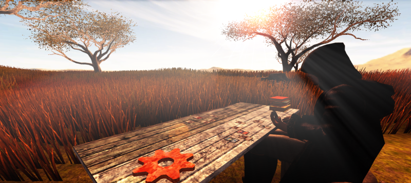
The project presented in this thesis is a card game in virtual reality. You can load in your magic deck and play cards if you have an Oculus Rift and a Leap Motion at hand. It has been created in collaboration with
Max Wandinger who focussed on the interactions in the card game (e.g. recognizing the hands and gestures like placing virtual cards on the table). My part was to create the environment and the avatar, and to provide a WIMP-based GUI that allows you to access object-related information. This is necessary as reading the content of a card with real-world dimensions is impossible due to the low resolution of the Oculus Rift.
WIMP-based user interface
Buttons
Several button types for VR have been designed and evaluated:

The timer button is probably the most intuitive button type applicable in VR. As soon as you look at it a progress bar fills up and after a certain amount of time the button is selected. Thus, you have a differentiation between the hover and selection event. This button is easy to use and understand and does not require a lot of head movement. However, by auto-selecting the button after some time without requiring a specific action that you do on purpose many false positives appear.
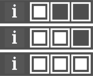
The three dots button is not useful for desktop applications, in fact I do not know any program using this button type. However, it has several advantages in VR and has been in use in e.g. Cineveo. The button consists of three empty squares, placed in a row. As soon as you look at the first square, it gets filled out and the second square is unlocked. By looking at the three squares one after another all the squares are filled and the button is selected.
As this button type has severe disadvantages, I implemented variations of this button that fix some of its problems.
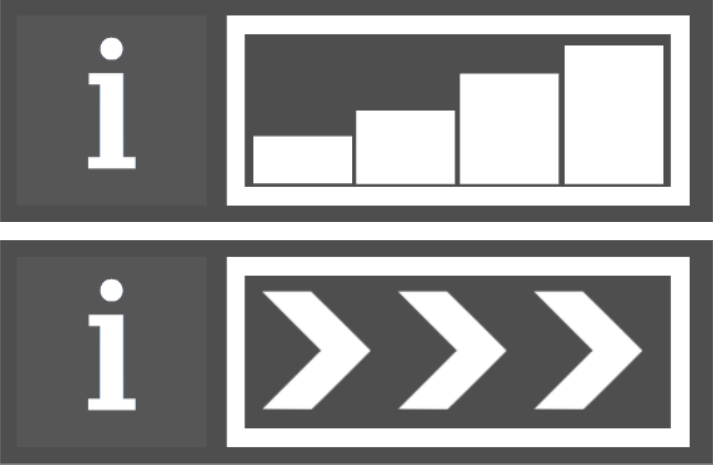
The first variation is a progress bar. It has the same logic as the three dots button but avoids borders between the dots and shows progess bars instead of the standard dots. Thus, it uses a well-known theme and is easier to understand.
The second variation is to show arrows instead of dots. These arrows clearly indicate the gaze direction and explain the buttons mechanics intuitively.

The last button option is the swipe button. It consists of a long rectangular area with a white circle inside that is positioned on the left side of it. To select the button, you need to look at the circle first to select it. Then you can drag the circle to the right side by moving your head. The circle can only move horizontally inside the defined area. To indicate this movement, semi-transparent arrows are shown in the background within the swipe area. Once the circle reaches the border on the right side, the button is selected.
This button is easily understood by most users as it resembles the swipe gesture known on many mobile devices. In iOS5, for example, you unlock the phone by dragging an icon from the left side to the right side with your finger. This button is received well by most users and can quickly be executed as it requires only one fluent motion.
Displays
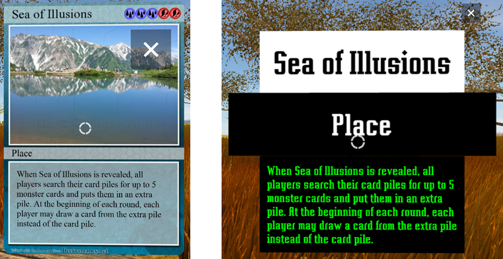
The most important requirements to the displays are that they show text in a readable form and are placed at a position that is comfortable for the user. The display types can be grouped in two categories. They either provide text boxes, the text in rendered in green with a pre-defined font to guarantee best readability, or they show an enlarged version of the inspected object to reveal more details.
Content
You can view or download the bachelor's thesis pdf
here. It describes the challenges of creating a user interface for VR, informs about the user studies done, and provides an explanation of the features of the game as well as a tutorial on how to setup all the devices (as the Oculus Rift is still a developer version and the Leap Motion feels like one, there are some annoying issues with usually simple workarounds).
A unity package is provided to reuse the buttons and displays in other applications. It can be downloaded
here.
The unity package contains all relevant content for the WIMP-based user interface. Furthermore, there are two sample scenes. "SampleScene_Buttons" contains all button types. A script registers to their "OnClick" event and changes the color of a quad on selection of a button. "SampleScene_Object_Info" shows how to make use of information objects. You can select a sphere and obtain sample information about it. Please note that this package has been created in Unity 4.6 and not been tested in Unity 5.
If you want to set up the UI on your own, you need to drag the "InformationController" prefab into the scene. Find the component "VRCameraEnable" on the prefab object and set the variables vrCam, leftVRCam, rightVRCam. If you do not use a virtual reality system, you only need to define vrCam. This script calculates the center position between the left and right eye camera. The new Oculus SDK already includes such a center object which you can drag on to the vrCam slot.
 The project presented in this thesis is a card game in virtual reality. You can load in your magic deck and play cards if you have an Oculus Rift and a Leap Motion at hand. It has been created in collaboration with Max Wandinger who focussed on the interactions in the card game (e.g. recognizing the hands and gestures like placing virtual cards on the table). My part was to create the environment and the avatar, and to provide a WIMP-based GUI that allows you to access object-related information. This is necessary as reading the content of a card with real-world dimensions is impossible due to the low resolution of the Oculus Rift.
 The timer button is probably the most intuitive button type applicable in VR. As soon as you look at it a progress bar fills up and after a certain amount of time the button is selected. Thus, you have a differentiation between the hover and selection event. This button is easy to use and understand and does not require a lot of head movement. However, by auto-selecting the button after some time without requiring a specific action that you do on purpose many false positives appear.
 The three dots button is not useful for desktop applications, in fact I do not know any program using this button type. However, it has several advantages in VR and has been in use in e.g. Cineveo. The button consists of three empty squares, placed in a row. As soon as you look at the first square, it gets filled out and the second square is unlocked. By looking at the three squares one after another all the squares are filled and the button is selected.
As this button type has severe disadvantages, I implemented variations of this button that fix some of its problems.
 The first variation is a progress bar. It has the same logic as the three dots button but avoids borders between the dots and shows progess bars instead of the standard dots. Thus, it uses a well-known theme and is easier to understand.
The second variation is to show arrows instead of dots. These arrows clearly indicate the gaze direction and explain the buttons mechanics intuitively.
 The last button option is the swipe button. It consists of a long rectangular area with a white circle inside that is positioned on the left side of it. To select the button, you need to look at the circle first to select it. Then you can drag the circle to the right side by moving your head. The circle can only move horizontally inside the defined area. To indicate this movement, semi-transparent arrows are shown in the background within the swipe area. Once the circle reaches the border on the right side, the button is selected.
This button is easily understood by most users as it resembles the swipe gesture known on many mobile devices. In iOS5, for example, you unlock the phone by dragging an icon from the left side to the right side with your finger. This button is received well by most users and can quickly be executed as it requires only one fluent motion.
 The most important requirements to the displays are that they show text in a readable form and are placed at a position that is comfortable for the user. The display types can be grouped in two categories. They either provide text boxes, the text in rendered in green with a pre-defined font to guarantee best readability, or they show an enlarged version of the inspected object to reveal more details.